Tuesday, November 30, 2010

A Conversation with Wayne Thiebaud

On Thursday, November 18, renowned painter and UC Davis art professor emeritus, Wayne Thiebaud, shared a conversation with art critic Kenneth Baker and a large (full house) audience of students and faculty. He spoke openly and humbly about his work, and his experience with painting as a practice for the last seventy years.
http://www.nga.gov/education/classroom/counting_on_art/img/img_thiebaud_frostedfractions_lg.jpg
As a realist, representational painter, Thiebaud’s signature images of cakes, hot dogs, and lipsticks, exemplify the importance of scale. Thiebaud discussed the concept of size and it’s relationship to scale as one of the challenges he faces in his creative process. Baker helped to shape the conversation, as he inquired about Thiebaud’s dependence on the subject, meaning whether he worked from memory, or direct observation. In response, Thiebaud revealed that for his paintings of lipstick and shoes, he worked from memory, building on conventions he learned during his time as an advertising art director. Also, his famous cakes and other food shapes were made from memory. A favorite quote from the conversation was his description of the cakes, in which he says, you just “make a circle, get out a spatula and ice the cake with paint.” Listening to these words spoken by the creator of an iconic painting (that I have admired for years), is incredibly insightful. He even revealed his daily routine, in which he wakes up early in the morning to paint, breaks for tennis and lunch with his wife, and then back to painting. The nature of his schedule speaks to his commitment as an artist, and how he enjoys making these perfect little worlds, which he refers to as a “privilege” to do everyday.
https://blogger.googleusercontent.com/img/b/R29vZ2xl/AVvXsEjFA5FQhnHqw-aibdvUxyt5igBXTHC05uJGziRR51NcByEqCWdnJJI5SDDX0Bt78xuL44epcYLYfaHbglrCK0_K7hIrtA5QFaPcHngpiX1md3tqeJzdsyIPEZlX8L8RJczYJ7t9kYtvR16Z/s1600/lemon+cake-sm.JPG

Baker addressed the idea that every really good painting should have a drop of poison in it, with the artist making the most beautiful thing he can and hoping there’s a tiny flaw in it. Thiebaud’s feeling on this concept is that there has to be contrast, meaning something a bit off, or strange about the painting. If the painting is too sweet, there’s not enough salt in it. More specifically, this idea transitioned into a dialogue about “Night City,” one from his series of paintings of San Francisco that depict the concept that cities strive to be more than they are. This work points to the way Thiebaud uses color and scale to work with the content information in the painting. By including intense light and dark colors, he plays up the dirtiness of a city. Using architecture and pavement in the painting, Thiebaud addresses the ambition and craziness of putting a big building on such little earth, juxtaposed by the marvelous joy of surrendering to a city. After this portion of the discussion, Thiebaud trotted out my other favorite quote of the day, “I’m in the oil business.”
Yes, you heard it here... Wayne means business.

After spending roughly an hour with an artist whom I hold in very high regard, I feel somehow closer to Thiebaud’s work, having been exposed to his sharpness and charming presence. At ninety years old, it was an absolute pleasure to listen to him speak, to put a face to his incredible artworks, and to witness a candid discussion about the challenges and successes during his 70 years of painting.

Monday, November 29, 2010

Green Roofs: This Way to Utopia

Imagine flying over a city in an airplane and looking out the window down at a sea of grass. Two words: Grass roofs. By sprouting gardens and greenery on rooftops, a comfortable urban jungle not only looks aesthetically pleasing as an observer standing atop a skyscraper, but also has great potential in taking a big step forward in environmental sustainability. Ecological advantages strives to contain water runoff, filter pollutants, reduce energy demand, cool cities, and preserve wildlife, just to name a few of the striking benefits of the project.
The California Academy of Sciences exemplifies a very attractive green roof, displaying the concept as being useful for public spaces as well as residential homes. Rooftop gardens have been growing in Norway for years, and they are also sprouting on top of apartments in Manhattan. Designed to serve many purposes and hopefully solve long-term environmental problems, the idea speaks to the impact of an architectural external design on an internal environment. In other words, green roofs will help to insulate homes and preserve heat inside.
The design is multi-purpose, with practical environmental advantages, as well as aesthetic appeal. With so many benefits, you may be thinking, it is a wonder we do not see more grassy roofs. One reason is that they are expensive to install at this point, but it is my hope that designers are working towards making the technology even more available, affordable and accessible to the general public. Green roofs are geared towards making a utopian society, and improving the world for humans and for planet earth.

Discussing vegetated rooftops is the first step towards not only educating but also inspiring designers, architects, and millions of people dwelling in cities all over the world, to contribute to the development of living roofs. Spread the word.

http://www.greenroofs.com/
http://www.roofportland.com/news-and-articles/guide-to-live-roofs-embracing-green-roof-systems-in-portland/
http://visitshoremagazine.com/2/?p=254

Who knew Teflon pans were dangerous?

Non-stick cooking pans produce chemical toxic gasses that are damaging to humans. Teflon cookware makes cleaning much easier than it used to be, before the invention of the non-stick feature.
Since its creation about forty years ago, we no longer have to scrub the pan's surface vigorously after making food and let it soak for hours. However, with this leisure comes harmful health risks. To be more specific, polytetrafluoroethylene, or PTFE, releases hazardous toxins when the pan heats up. The Environmental Protection Agency (EPA) conducts studies that hopefully will lead to safer cookware. Exactly how dangerous this product design is, has been arguable amongst scientists. Some say that bad toxins are released only if the pan is abused by temperatures too high. This leads to another issue concerning a product and its safety, and how that relates to social responsibility. Is it the designer's error if a product is used incorrectly?

It could be said that it is the user's responsibility to be aware of an object's consequences or risks. Of course, this is debatable and the discussion relies on case-by-case situations and individual items. However, the concept of a product being dangerous points to the relationship between the designer and one who uses the design. Intentional and unintentional consequences are inherent in design in society in general, with the designer making a design with the audience's best interest in mind. People who use the product are making a choice to accept any risks that come with it.

For example, we buy things like non-stick cookware, and a majority of us are unaware or uninformed of its health consequences. With something like a pan emitting toxins, we do not usually notice immediate repercussions of its danger, meaning we do not notice specific symptoms after we eat whatever we just made in the pan. Even if we were to get a headache after eating eggs that we made in a Teflon pan, we probably would not immediately blame the pan as the cause. However, the reality is that ninety-five percent of Americans have PFOA in their bloodstream, probably due to overheating it on the stove.
What makes a design dangerous depends not only on the designer's considerations and ergonomic design, but also on the way in which it is used, considering it's physical components and materials.http://www.nccecojustice.org/images/non-stick_pan.jpg

With a design that is intended to make our time in the kitchen a better experience, comes downsides and dangerous consequences as far as health. In considering non-stick cookware, it becomes clear that the relationship between the designer and the person using the design, is incredibly important. Safety concerns and constraints are presumably in mind during the design process of objects we encounter, and we must be aware of our social responsibility to use products as they were intended by the designer, taking danger into account. We can only hope that with research and technology, the production of cookware will be improved. In the meantime, be careful not to turn up the heat too high!

http://www.wisegeek.com/what-are-the-risks-of-using-teflon-pans.htm
http://health.ninemsn.com.au/whatsgoodforyou/theshow/694373/are-teflon-coated-pans-harmful
Photo: http://articles.mercola.com/sites/articles/archive/2005/07/12/nonstick-cookware-cancer.aspx

Coco's Image Transformed Through Color

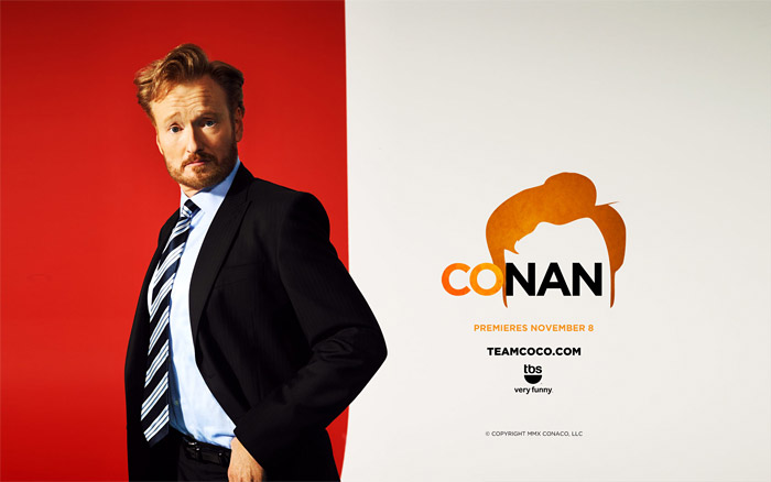
When Conan O'Brien transitioned from the Tonight Show with Conan O'Brien, to a new show called Conan on TBS, promotional designs used color to emphasize his iconic hair. In a series of images that incorporate black, white and orange, and the typeface Gotham, the popular television personality is reinvented, marking the transition in his career as a talk show host.

Logo variation for light backgrounds, seen in this desktop wallpaper from TeamCoco.com

Since the beginning of his career as a television host in 1993, O'Brien's public identity has been shaped by his striking red hair as a salient characteristic. So it makes sense that TBS would capitalize on his hair as an important and humorous visual quality for his new show. Color is strategically used to glorify and dramatize his legendary hair. It appears the graphic designer drew a shape in a program like Illustrator, filled it with a vibrant orange, including tonal gradients to create a sense of texture, and to focus the viewer's eye. Notice that in each of the nine visuals shown below, a representation of his hair is included in some way. This design motif is strengthened by the composition of each image, including the words.

Aside from the bold typeface, the colored fill of the text also works to enforce his bold personality, with white letters on a black background, the most easily legible color combination. Josef Albers discusses this concept in Interaction of Color. The use of color in these posters, and how it interacts with the overall composition, as addressed by Albers, serves to lead the viewer's eye around the image. By contrasting black and white background and words, with the striking orange color, the designer visually communicates the significance of his hair, the notable content of focus in the image. Additionally, the use of color creates a gestalt reaction in the viewer, unifying the image and text, as black, white and orange are cleverly tied together throughout each composition.

The bold use of unified colors in the promotional visuals for Conan work successfully to communicate his hair as a salient characteristic, using color in relation to the gestalt theory, and ultimately making a visually striking representation of Conan's public persona.

Various ‘Team Coco’ campaigns and promotional material

http://www.idsgn.org/posts/cocos-new-do/

Monday, November 15, 2010

Central Park: The Biggest Park in the Biggest City

Central Park was designed by Frederick Law Olmstead. In 1853, there was a National Competition, and 33 designs were submitted. It is the heart, or as some call it, the "lungs" of Manhattan, New York. It's greenery and open space allows the residents of NYC to breathe fresh air, engage in recreation and enjoy the outdoors. All year round, there is something for everyone to enjoy within the park. Today, all different kinds of people use the facility in harmony, a function of the park's design.


Initially, Olmsted's vision was to create a place to observe and respect nature, with culture as a secondary concern. During the early years, the park catered to the upper class, and gatherings and music were discouraged. These principles of an oasis, an escape from the city, in the middle of the city, guided the development of the park. As the years passed, this idea did not fit the park that the city needed. Over time, it became a place with a wide variety of uses, for play.

Geographically, or typographically, the park is 51 blocks deep, with a perimeter of 6 miles, and 843 acres of park land.
More stats: 26,000 trees. 58 miles of pedestrian paths. 36 uniquely designed bridges. 9,000 benches. 21 playgrounds. Not to mention, the park is ecologically diverse, with 275 species of migratory birds that make their way through.
Aside from these numbers, the park is rich with a lake, waterfalls, broad walkways, scenic overlooks, a pond filled with turtles, and a garden with plants from Shakespeare's plays and books. There are activities galore, and it is a perfect space for dogs, readers, musicians, sunbathers, carousel riders, ice skaters, roller-bladers and bikers (http://thirtyconversationsondesign.com/lindatischler/index.html).


At the end of the project, the landscape looked nothing like the land did before. It was completely transformed by Olmsted's design, and the Irish and Russian immigrant workers who actually made it. Olmsted's design has allowed people to enjoy the public facility in harmony as a function of the park's physical characteristics.

Interesting to note: With sculptures of famous men throughout the park, and one famous dog, there are no sculptures of notable women (only fictional: Shakespeare's Juliet, Alice in Wonderland). Someone, go build a sculpture of a woman in Central Park!

QWERTY Keyboards: Ergonomic Design

Typing on a keyboard is an integral part of our ability to communicate and experience computers. We have trained each finger to know which key to hit in order to indicate certain letters, creating words on the computer screen. The arrangement of the letters, the spacing between each key, the symbol keys, or tools like shift, enter, or delete. These elements of the keyboard work together and are geared towards user-centered, efficient design. Considering the importance of the keyboard's function, it is crucial to examine the ergonomic research or design criticism of its form. As a product, it should be safe, comfortable, easy to use, productive in its performance, and simple in its aesthetic appeal.

As far as safety, the keyboard does not have the capabilities to cause any serious physical harm to a user. However, studies have shown that some people have experienced soreness, and even carpal tunnel syndrome, a result of bending the wrist at a certain angle. As a reaction to these problems, split keyboards were designed, which have the keys oriented in different ways, allowing the user to more comfortably type at angles that may be better suited for them. To maximize comfort, some keyboards are made with the option to raise it or lower it, adjusting the unit to fit one's needs, according to their individual muscle strain. It is important to adjust the hands and wrists to be in a comfortable position that is not bent in a harmful way, especially when typing for a long period of time.

The earliest form of a keyboard that we know of is the typewriter, an attractive piece of machinery which shares the same QWERTY arrangement of letters as they keyboards we use today. So, where did the idea for QWERTY come from? There are theories that lay claim to its origin, like the ones found in this article here.http://home.earthlink.net/~dcrehr/IMAGES/Q.78pat.jpeg

The most common myth is that early typewriter models were prone to getting jammed by writers who typed too fast. As a reaction to this problem, QWERTY was invented by C.L. Sholes. The design strategically places most commonly used letters on different sides of the keyboard in an effort to slow down the typist's fingers to eliminate jamming as a mechanical limitation. Of course, this notion has been questioned and debated.

(Photo taken by me at Jack London's cottage in the "Valley of the Moon," Glen Ellen, CA)

After much research on the matter, another story seems to be closer to the truth. In 1868, Sholes worked with manipulating letter pairing and arrangements in an effort to reduce noise and jamming that his first typewriter model produced. In effect, QWERTY was made and it reduced "annoying clashes" as well as being successful in its ability to "speed up typing rather than slow it down."

A glimpse into Sholes' creative process of 142 years ago, showcases an example of design that has proven to be classic and timeless in its efficiency as a crucial tool in modern communication. The fact that we still use the same QWERTY arrangement of letters speaks to the power of smart, productive, easy-to-use and efficient design and its ability to transcend time and space. While QWERTY was born for a typewriter, it is now used on cellphones. See below, a concept design for an iPhone QWERTY keyboard. Who knows, could be the next big thing.

Considering the QWERTY keyboard's ergonomic design, including its safety, comfort, ease of use, performance, and aesthetics, it is certainly a successful and long-lasting design. Aesthetically, the keyboard is generally simple and straightforward, with no colors to speak of, that aren't white, gray, silver or black, and no patterns that clutter the keyboard. Personally, I like it that way. (Although some companies make sleeker keyboards than others... Apple versus Dell, par example). Through observation and years of personal use with different keyboard styles (one main distinction being laptop versus desktop), the design is an easy to use mass-produced item that is proficient in its task. Thanks for sticking around for so long, QWERTY.

Saturday, November 6, 2010

Introducing: Spoonachos.

Say it with me: "Spoonachos." It rolls off the tongue nicely, doesn't it? Envisioned by Serbian designer Denis Bostandzic, the design is a chip made into the shape of a spoon. While it is only a concept at this point, get ready for it. I already have a feeling it will be on grocery store shelves sooner rather than later, considering it's ingenuity. It is intended to improve the enjoyment and easiness of scooping dips like salsa and guacamole onto the chip. It pretty much one-ups Tostitos "Scoops" tortilla chips. Take a closer look at these designs below.


Images from DENIS BOSTANDZIC BLOG.

The images above showcase the design of the Spoonnachos concept. They highlight the form of the chip, and suggest it's function by including a hand that holds the salsa-scooped chip in one, while the image on the right features an attractive container of guacamole. As you can see, the hand model exemplifies the way the shape is intended to be handled, with the thumb holding or resting on the tip of the utensil shaped product, and the index finger and the rest of the hand bent accordingly, as it would naturally. This is a clever design, ready to be purchased and published, and the advertisements already feature a logo, with a chosen typeface that appears to be bold, filled with white, and has a small representation of a spoonnacho resting above the "po" letters. The subtext says exactly what it is, "spoon shaped nachos." These prototypes look modern and sophisticated, using technical tools like a bright white background, with a light grey gradient, making the Spoonnacho look appealing (although I must say, I don't like the way the hand fades into space and blends off the page).


Images from DENIS BOSTANDZIC BLOG.

These images illustrate the geometry of the design, the physical measurements that comprise the shape and form of the concept, giving it meaning and purpose. The bottom one is a simple mathematical equation of addition is displayed, showing us that a spoon + nachos = spoonnachos, with a helpful photo to correspond with each variable.
In all four images above, the designer gives us information about the concept, an effort to interest companies in purchasing the project. Also on his blog, Bostandzic introduces himself with this line: "Hi, welcome to my playground. My first name is pencil, my last name is a drawing board and the middle name is workshop, my birth given name is Denis Bostandzic." As a designer, the way he presents himself is important, and his reference to his playground underscores the significance of "play," as we have discussed in Design 001 lectures. As a designer, beginning the creative process by playing often leads to productive ideas and then successful inventions that can be used to improve our daily lives, even in the smallest or most simple ways, like the smart curvature of a chip. Spoonnachos, I look forward to eating you.

Bob Dylan: A Wordy Music Video

Made in 1965, Bob Dylan's "Subterranean Homesick Blues" music video combines words written on cue cards, with the moving image of him flipping through them, displaying the lyrics as he sings the song.


http://www.metacafe.com/watch/sy-187835137/bob_dylan_subterranean_homesick_blues_official_music_video/

(Insert Bob Dylan "Subterranean Homesick Blues" music video)

Dylan stands still in an alleyway in London, holding the flash cards in his right hand, and using his left hand to swiftly yet casually move through the layers of cards, revealing the next words of the song, written in all caps letters. There are small moments that intentionally create slight dissonance between the words and image, like when Dylan sings "eleven dollar bills," he flashes a "20 DOLLAR BILLS" sign. This was a collaboration, with the help of Allen Ginsberg and Bob Neuwirth, two contemporaries who helped write the signs (and appear to be lurking in the background throughout the video). Interesting to note, one of the cards says "alley way," words that not only are written in the song of course, but match the physical imagery or setting where he stands in the video.

This video itself is simple, using text and imagery to work together smoothly with the music, not to mention incredibly modern and innovative for the time. This simplistic approach, with the camera still the entire time, shot in black and white with no edits, and little movement but the flipping of the cards, certainly serves as an inspiration for future artists and designers. Quite literally, the same song and the visual text technique as seen in the original music video, was used in a recent advertisement for Google Instant, please see video below.


http://www.youtube.com/watch?v=qcm0rG8EKXI

(Insert Google Instant video )

Google Instant is a feature that predicts words as you type them into the search engine, and allows you to quickly see the generated results as you type each letter of each word. Without even pressing "enter," or clicking "search," links will appear below the search bar space where you are typing. This Google update results in very fast, literally instant gratification. Users are able to see results, while they type, much like we see what Dylan sings, as we hear him sing. This correlation between word and image is quite powerful, as demonstrated in the advertisement by Google (which, by the way, rarely makes advertisements or advertises to the public). Ads like this, using image and word to deliver a message, are extremely effective, and speak to the way Dylan's iconic video in '65 has influenced and enforced the way text and picture work together in visual communication.

Comic Strips: Word and Image Transforming Time and Space

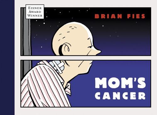
Comic book illustrator Brian Fies came to speak as a guest lecturer last week, presenting an open discussion of his creative process, using the combination of word and image as mediums of visual communication. He spoke openly about two of his published graphic novels, Mom's Cancer and Whatever Happened to the World of Tomorrow? Fies shared pages from each work in a powerpoint presentation, explaining the way in which the medium's use of word and pictures have the ability to manipulate time and space. Through storytelling tools like symbolism and metaphor, and technical aspects like color, comics use both language and drawing techniques to visually communicate a narrative. As a cartoonist, details are very important, and Fies touched on the significance of considering CMYK (Cyan, Magenta, Yellow, Black), as used for pigment ink print, versus RGB (Red, Green, Blue), used as light in computer monitors, for example. As for any artist or designer, the consideration of color theory is crucial, as explained by Fies, who used a different color in each chapter in WHTTWOT, setting a different time or place in the story.

http://sumthinblue.com/wp-content/uploads/2010/03/fies-moms-cancer.jpg
Brian Fies (copyright Brian Fies).

As a UC Davis alumni (Go Aggies), Fies' started working on what became his first published book, not with the goal of publishing it in mind, but rather, as a personal project that drew on his family's struggle with his mother's lung cancer. Hence the name, Mom's Cancer. When she was diagnosed with lung cancer, Fies documented the process through sketches, from her chemotherapy sessions, to the tension that grew between him and his sisters, to his mother's last birthday party and subsequent goodbye. Working through the situation, his struggles were translated from ink to paper, and then on the internet. Unbenounced to his family, he posted the comic of their story on the web, and soon he had many readers, eventually leading to his discovery by an editor. One thing let to another, and finally Fies could hold a tangible comic book that can now be found in book stores.


Brian Fies, panel from Mom's Cancer (copyright Brian Fies).

By transforming a blank piece of white paper, through sketches and character development, and working with designers and publishers to create a book cover, the process of making a comic book is an extremely detail-oriented and expressive experience. By presenting a sequential series of panels, comics serve as a simplified form of storytelling, using words in a direct and concise way (in Fies' case, the words are handwritten, creating a more authentic print), knowing that the audience reads the text first and refers to the picture secondarily. Because of the physical layout and format of a comic book, the illustrator seeks to distill the essence of each page or scene, using form to communicate meaning.


Brian Fies, panel from Mom's Cancer (copyright Brian Fies).

A quote that Fies' closed his lecture with, and one that I have been aware of for most of my life (something my dad has referenced many times), beautifully said by Blaise Pascal, goes like this:
"I apologize that I made this letter so long, I did not have time to make it short."
These words are useful and incredibly relevant to designers, as it speaks to the challenge we face in being as direct as possible in communicating a message to our viewers.To reference once again Gary Hustwit's documentary Objectified, designer Dieter Rams discusses the notion that good design is "as little design as possible."

Fies' work displays comics as a medium that combines words and pictures, transforming time and space. After having been exposed to Fies' creative process, we catch a glimpse of how we, as artists or designers, face challenges, work within our constraints, and have the ability to articulate ideas and successes in our work.

Monday, November 1, 2010

The Moleskine Notebook (for the ages)

The Moleskine notebook has something for everyone. It's design is clean and it's form serves it's function well, as the shape of the notebook lends itself to being easily used. Everyone, whether you are a student or a professor, a musician, a writer, a scientist, a mathematician, a chef, and so on and so forth, has thoughts, ideas, or sketches, or a combination of the three, to jot down. Tired of writing these things on a napkin or even on your hand? The moleskine is the answer.
http://2wheeledlife.com/wp-content/uploads/2010/07/moleskine.jpeg

The Moleskine is available in three sizes, in red or black, with a hard or soft cover, and with either lined paper or non-lined paper. These options are ways for the consumer to shape their needs to the Moleskine and customize it according to their interests, while keeping the design simple and classic, adding nothing too jazzy or superfluous. As far as function, there is an elastic strap that wraps around the front to keeps the notebook closed, which can be used to keep loose notes like receipts or papers, maybe index cards, post-its or receipts, inside the notebook so they do not fall out. It can easily be opened by sliding it to the side. The paper inside is durable, and with lined paper or blank paper, the customer will have the option to have the guidance or structure of lines, or a clean sheet that allows for drawing and sketching. These are the reasons why it can and should be used by anyone. As a mass-produced object, the Moleskine is a useful product that is a quality example of industrial design that has the power to be long-lasting, and attractive to a very large demographic of buyers and consumers.
Designed by designers, for designers (and absolutely anyone else), the form of the Moleskin provides a clean and classy aesthetic, while being durable and portable. I cannot even count the number of Moleskines I have gone through so far in my life, effortlessly pulling it out of my backpack or purse at any given moment to scribble and sketch, filling up each page, front and back, with notes, lists, ideas. And you ask why I keep going back for more Moleskine.
As designers, everything we make comes from an idea that sprouts in our head, and writing the idea down on paper is the first step to making it happen. Plain and simple.
Calling all Brainstormers: Go buy a Moleskine.

Also, Oscar Wilde, Vincent Van Gogh, Pablo Picasso, Ernest Hemingway and Henri Matisse, are all said to have used the legendary Moleskine. Does that factoid inspire you to go out and purchase a handy dandy Moleskine today or what?

One more thing to my fellow bloggers in the blogosphere, I thought you would appreciate this limited edition Swiss Helvetica Moleskine. The fact that uber popular typeface Helvetica has been printed on a Moleskine, speaks to just how relevant the Moleskine is amongst designers. I think it's a winning combination. I want one!

Moleskine notebook

Sunday, October 31, 2010

Big Bambú: You Can't, You Won't, You Don't Stop

Identical twins Doug and Mike Starn created "Big Bambú: You Can't, You Won't, You Don't Stop," a large installation on the rooftop of the Metropolitan Museum of Art in New York. It involved two artists, and twenty rock climbers to construct a structure made of 5,000 pieces of bamboo and 50 miles of nylon rope. The piece opened to the public on April 27, 2010, and its dismantling began last week. Over the course of the six months it was featured at the Met, the crew continued to add material to it, using lots of rope to secure it, allowing viewers to come walk on it and explore the walkways and maze of bamboo thicket as it was constantly being worked on. (Three proposals even happened in it, or on it, during its construction. For those of us who were unable to climb to the top of it, we can only imagine that the views of the city and of Central Park are glorious.)
bigbambu-2010-shotbyjake-com-1037Photo by Shot By Jake|Photography
Photo by Librado Romero/The New York Times

This idea that form is "constantly active, but always the same" is something that the artists pursue in their work, using the materials and working within their constraints, to create an interactive experience for their viewers on a large scale. The connective tissue, or rope, is where the activity happens, because it is the inter-connectivity that binds the bamboo and forms a sturdy shape. Besides the physical constraints of the amount or supply of bamboo and rope, (not to mention the weather, which caused them to pause work for a week every time it rained). the process of making the work in a rooftop space presented its own challenges.
As they continued to build the artwork day by day, the Starn brothers and their team of rock climbers drank beer and listened to music like Jimi Hendrix and the Rolling Stones (Pogrebin).
Speaking of constraints, “'It’s amazing that the Met had the nerve to take on an evolving structure like this,' Mike said. 'But we had to pull them along to create something about chaos. It’s a habitat. They wanted us out at 5 o’clock. But we’re not just here working. We’re a part of it. They didn’t like that — the beers. We finally got them to understand that this piece wouldn’t exist if it were too controlled. The vibe is important.'”
This communication between the artists and the Metropolitan Museum of Art is an example of design as conversation, as well as working within the constraints that present themselves during a project.Over the course of its progression, people would come back to the rooftop more than once to check on the status of the growing and changing Big Bambu. This kind of interaction is a way for people to feel they are part of something larger than themselves that is growing and changing, and they are able to experience the process.

Photo by Shot By Jake|Photography

Photo by Shot By Jake|Photography
The Starn brothers have created an installation piece that speaks to the intersection between art and design, as it is presented in an art gallery space (albeit outdoors on the rooftop of the Metro Museum), yet the nature of this art piece shares characteristics of design as a process in which artists and designers work within constraints in a process that creates a realm of experience for its viewers. Like design, this art piece is about the process, not the final product.

Friday, October 29, 2010

Objective: Design

Objectified

Gary Hustwit's documentary film, Objectified, addresses the meaning of objects and design in our everyday lives. He examines how form and content interact in the functionality of products we encounter daily. Through interviews with designers from all over the world, including representatives of SmartDesign, the Bouroullec brothers from Paris, Chris Bangle of BMW Design, and Tim Brown of IDEO, viewers are exposed to a glimpse of how design functions in society today. Each designer discusses what makes good design, and the relationship that humans have with the products we use.


Through the standardization of mass produced objects, design has the power to reach millions and millions of people, with designers making things that are geared towards improving people's lives without them even noticing. Design is the search for form, not only that of physical or tangible objects but also using form to shape people's choices. As discussed in the film, the nature of design is a strong focus on the new, about what is going to happen, not what has happened.

See a few of the designers featured in the film, including Jonathan Ive of Apple, Australian Marc Newson, and Alice Rawsthorn, with director Gary Hustwit.

Form follows function. These three words are key to the business of design. Let us consider objects like a spoon and a chair. As mentioned by Rawsthorn in the film, if a martian were to land on earth and encounter a spoon, it would observe its shape and form, and be able to figure out it's purpose. Likewise, the form of a chair suggests and communicates it's function. These are industrial design products that's invention preceded the digital age, and they maintain their meaning as examples of design's "form follows function" philosophy.

(Is that a spoon? The simplicity of the object's form in this illustration reminds me of Rene Magritte's The Treachery of Images, doesn't it? Just a little bit?)

Below, see a rough example of an early design of a wooden chair.

Also, see a lounge chair designed by Charles and Ray Eames in the 1950s, a modern example of the progression of the chair's form following function.


The viewer gains access to behind-the-scene moments in design firm offices, allowing us to see the prototypes, sketches and on-screen digital development of product design, such as a potato peeler. The new and improved potato peeler is a reaction to the dissatisfaction of the uncomfortable peeler that preceded OXO's Good Grips version.

Image

Renowned German designer Dieter Rams lists attributes of what makes good design, including descriptors such as "environmentally friendly, long-lived, unobtrusive, consistent in every detail, and as little design as possible." These qualities speak to the goal of designers in creating objects that will achieve a new, aesthetically appealing design, while having the potential to be long-lived in its purpose and function.

Monday, October 18, 2010

This One or That One?

As designers, we engage in a decision-making process in which we work within our constraints, comparing and contrasting ideas, and sparking conversations amongst our viewers.


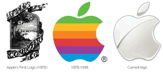
The evolution of Apple's logo.

A brand's logotype plays a very important role in creating a company's public image, a visual or a token typeface for which people associate with the name. Recently, major retailer The Gap decided to introduce a new logo, using the popular Helvetica font. This is the current typeface for brands American Apparel, Target, Staples, Microsoft, Panasonic and Crate&Barrel, just to name a few. We see Helvetica printed daily, with so many top-selling big time businesses using the sleek and powerful typeface, in sizes big and small. So what's the big deal with Helvetica?

Helvetica-film

Helvetica is attractive. It is easily readable, and has a clean aesthetic. The typeface has been so successful largely due to it's accessibility, and it's effectiveness in big headlines, display, and also body text. It looks just as good on small documents as it does on big airplanes. Since it's creation in 1957 by Swiss designer Max Miedinger, the sans-serif typeface has maintained it's strikingly modern and versatile appeal. So, why didn't bloggers and internet-surfers like it when the Gap transitioned from their original logo, below, to their updated, modernized version?

Americans who have long been exposed to The Gap's advertisements and big presence in consumer culture, have learned to link the iconic image on the left to its corporate identity. Shoppers see the logo in magazines and on shopping bags, and think of the company's affordable khaki pants, classic jeans and comfortable cable-knit sweaters. Most likely they also consider the token Gap sweatshirts that have that exact logo printed in big font on the front, as seen in the recently released movie The Social Network, worn by Mark Zuckerberg.


Over the years, it has become the classic design for the Gap, a trademark symbol for the company. The t-shirts and sweatshirts with their logo printed on them was a big part of their success during the 90's. Now, current creative director Patrick Robinson has expressed interest in "elevating the brand." So strategically, the first step in improving business would be to try to revitalize with a new logo. Which brings me to, the new logo. Featuring a blue box with gradient, to reference a technical graphic design term, the image just feels generic, as expressed and quickly replicated by a blogger who posted this video on YouTube.


Very soon after listening to the negative feedback from their customers, The Gap decided to go back to their original iconic logo. This move is an example of how powerful design is in society, meaning it has the capacity to quickly spark an online media frenzy, creating buzz all over the internet and prompting conversation and dialogue amongst people everywhere. By looking at two visual images that feature different typefaces and layouts but send the same advertising message using the same text, the viewer compares and contrasts the old and the new, considering the value or significance of the brand, and feels that the modern image is simply not as effective as the iconic one that we know and love.

Let us consider American Airlines, a company that, according to Gary Hustwit's documentary film Helvetica (promo ad pictured above), has never changed their logo, which happens to be in the typeface Helvetica. After seeing the onslaught of negative reactions to the Gap's effort to modernize their branding image, my guess is, people wouldn't be happy if American Airlines did the same thing. Unless it looked really good.