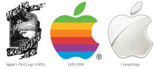
The evolution of Apple's logo.
A brand's logotype plays a very important role in creating a company's public image, a visual or a token typeface for which people associate with the name. Recently, major retailer The Gap decided to introduce a new logo, using the popular Helvetica font. This is the current typeface for brands American Apparel, Target, Staples, Microsoft, Panasonic and Crate&Barrel, just to name a few. We see Helvetica printed daily, with so many top-selling big time businesses using the sleek and powerful typeface, in sizes big and small. So what's the big deal with Helvetica?
Helvetica is attractive. It is easily readable, and has a clean aesthetic. The typeface has been so successful largely due to it's accessibility, and it's effectiveness in big headlines, display, and also body text. It looks just as good on small documents as it does on big airplanes. Since it's creation in 1957 by Swiss designer Max Miedinger, the sans-serif typeface has maintained it's strikingly modern and versatile appeal. So, why didn't bloggers and internet-surfers like it when the Gap transitioned from their original logo, below, to their updated, modernized version?
Americans who have long been exposed to The Gap's advertisements and big presence in consumer culture, have learned to link the iconic image on the left to its corporate identity. Shoppers see the logo in magazines and on shopping bags, and think of the company's affordable khaki pants, classic jeans and comfortable cable-knit sweaters. Most likely they also consider the token Gap sweatshirts that have that exact logo printed in big font on the front, as seen in the recently released movie The Social Network, worn by Mark Zuckerberg.
Over the years, it has become the classic design for the Gap, a trademark symbol for the company. The t-shirts and sweatshirts with their logo printed on them was a big part of their success during the 90's. Now, current creative director Patrick Robinson has expressed interest in "elevating the brand." So strategically, the first step in improving business would be to try to revitalize with a new logo. Which brings me to, the new logo. Featuring a blue box with gradient, to reference a technical graphic design term, the image just feels generic, as expressed and quickly replicated by a blogger who posted this video on YouTube.
Very soon after listening to the negative feedback from their customers, The Gap decided to go back to their original iconic logo. This move is an example of how powerful design is in society, meaning it has the capacity to quickly spark an online media frenzy, creating buzz all over the internet and prompting conversation and dialogue amongst people everywhere. By looking at two visual images that feature different typefaces and layouts but send the same advertising message using the same text, the viewer compares and contrasts the old and the new, considering the value or significance of the brand, and feels that the modern image is simply not as effective as the iconic one that we know and love.
Let us consider American Airlines, a company that, according to Gary Hustwit's documentary film Helvetica (promo ad pictured above), has never changed their logo, which happens to be in the typeface Helvetica. After seeing the onslaught of negative reactions to the Gap's effort to modernize their branding image, my guess is, people wouldn't be happy if American Airlines did the same thing. Unless it looked really good.

Let us consider American Airlines, a company that, according to Gary Hustwit's documentary film Helvetica (promo ad pictured above), has never changed their logo, which happens to be in the typeface Helvetica. After seeing the onslaught of negative reactions to the Gap's effort to modernize their branding image, my guess is, people wouldn't be happy if American Airlines did the same thing. Unless it looked really good.


No comments:
Post a Comment