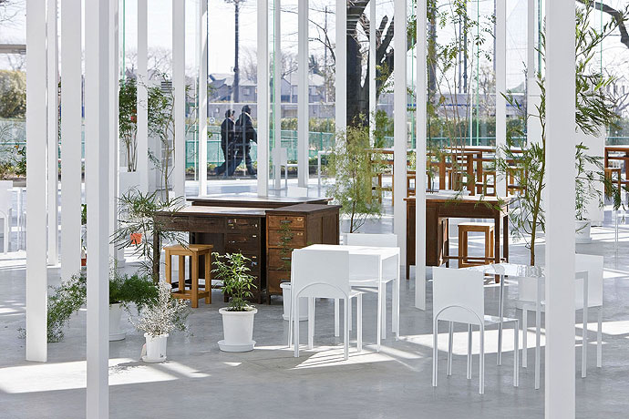
Photo by Shot By Jake|Photography
 Photo by Librado Romero/The New York Times
This idea that form is "constantly active, but always the same" is something that the artists pursue in their work, using the materials and working within their constraints, to create an interactive experience for their viewers on a large scale. The connective tissue, or rope, is where the activity happens, because it is the inter-connectivity that binds the bamboo and forms a sturdy shape. Besides the physical constraints of the amount or supply of bamboo and rope, (not to mention the weather, which caused them to pause work for a week every time it rained). the process of making the work in a rooftop space presented its own challenges.
As they continued to build the artwork day by day, the Starn brothers and their team of rock climbers drank beer and listened to music like Jimi Hendrix and the Rolling Stones (Pogrebin).
Speaking of constraints, “'It’s amazing that the Met had the nerve to take on an evolving structure like this,' Mike said. 'But we had to pull them along to create something about chaos. It’s a habitat. They wanted us out at 5 o’clock. But we’re not just here working. We’re a part of it. They didn’t like that — the beers. We finally got them to understand that this piece wouldn’t exist if it were too controlled. The vibe is important.'”
This communication between the artists and the Metropolitan Museum of Art is an example of design as conversation, as well as working within the constraints that present themselves during a project.Over the course of its progression, people would come back to the rooftop more than once to check on the status of the growing and changing Big Bambu. This kind of interaction is a way for people to feel they are part of something larger than themselves that is growing and changing, and they are able to experience the process.

Photo by Shot By Jake|Photography
 Photo by Shot By Jake|Photography
The Starn brothers have created an installation piece that speaks to the intersection between art and design, as it is presented in an art gallery space (albeit outdoors on the rooftop of the Metro Museum), yet the nature of this art piece shares characteristics of design as a process in which artists and designers work within constraints in a process that creates a realm of experience for its viewers. Like design, this art piece is about the process, not the final product.